Sankey Plots
Sankey plots (often called Sankey diagrams) provide a way of visualising temporal data flows/relationships between data entities/nodes, and can be generated using the fig_sankey() function.
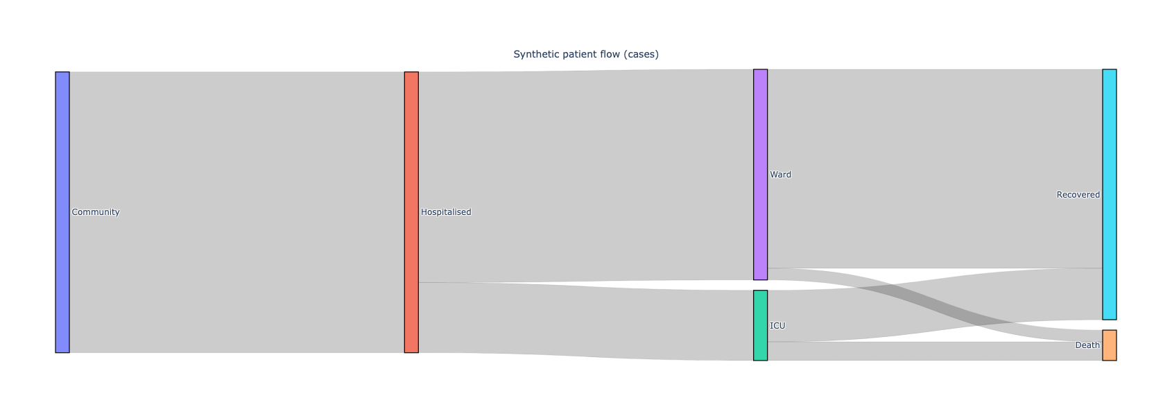
The plot above was generated using a synthetic dataset for a hypothetical community of 1200 people who are hospitalised. Click the image to view the full interactive and fully annotated Plotly figure that you will be able to see when you generate it.
Here is the dataset that was used to generated, given as a table (which can easily be converted to a CSV).
Source |
Target |
Value |
|---|---|---|
Community |
Hospitalised |
1200 |
Hospitalised |
ICU |
300 |
Hospitalised |
Ward |
900 |
ICU |
Death |
80 |
ICU |
Recovered |
220 |
Ward |
Recovered |
850 |
Ward |
Death |
50 |
Here are the Python steps you need to generate the plot using the fig_sankey() function:
import pandas as pd
from isaricanalytics.visualisation import fig_sankey
# Load the CSV data from a string buffer
data = pd.read_csv(io.StringIO(
    """source,target,value\n
       Community,Hospitalised,1200\n
       Hospitalised,ICU,300\n
       Hospitalised,Ward,900\n
       ICU,Death,80\n
       ICU,Recovered,220\n
       Ward,Recovered,850\n
       Ward,Death,50"""
))

# Create the labels, nodes, flows/arrows and annotations
labels = pd.Series(pd.unique(flows[["source", "target"]].values.ravel()))
node = pd.DataFrame({
    "label": labels,
    "customdata": labels.apply(lambda x: f"{x} (synthetic)")
})
label_to_idx = {label: i for i, label in enumerate(labels)}
link = pd.DataFrame({
    "source": data["source"].map(label_to_idx),
    "target": data["target"].map(label_to_idx),
    "value": data["value"],
    "customdata": data.apply(lambda r: f"{r['source']} → {r['target']}: {r['value']} cases", axis=1)
})
annotations = pd.DataFrame([{
    "text": "Synthetic patient flow (cases)",
    "x": 0.5,
    "y": 1.08,
    "xref": "paper",
    "yref": "paper",
    "showarrow": False,
    "font": {"size": 14}
}])
fig = fig_sankey([node, link, annotations], height=600)
fig.show()
You should see the plot appearing as given above.